The process of positioning graphic and textual elements on a screen or piece of paper to draw the reader's eye and convey information in an appealing manner is known as layout design.
How Do You Create a Layout?
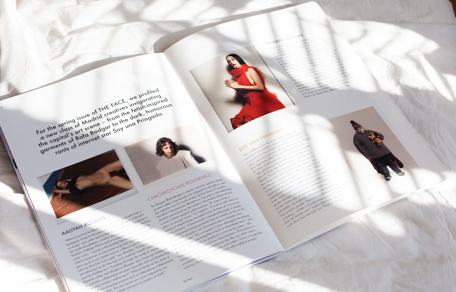
Layout design is the process of positioning visual elements on a page, such as text, photos, and shapes. A layout design is required for any project that expresses a message through striking visuals, such as magazine layouts, website designs, and commercials. Good layout design is both dynamic and clear, creating visual points of interest that lead the reader through a piece of material without obscuring its message. Many layout designers use a set of tools to create a unique layout design.
Five Layout Design Elements
When creating a layout design, any designer will use these basic design elements.
Text blocks used in layout designs include headlines, subheadings, headers, footers, and paragraphs. Menus and buttons are also examples of text in web design. Any typographic design you choose can convey a specific mood, and you can combine different text types to achieve different effects.
Image: In graphic design, images can be pictures, drawings, or infographics that are incorporated into the layout.
Large graphics can capture your audience's attention and convey messages without the use of words.
Line: A line is a path in space that connects two points. Lines, whether vertical, diagonal, or horizontal, can aid in drawing the viewer's attention to a specific area. They can aid in the separation of visual components or portions of your visual layout.
Shape: A shape, in its most basic form, is a two-dimensional region surrounded by an outline. Organic shapes found in nature, geometric shapes that are angular and mathematically consistent, and abstract shapes that attempt but fail to portray elements of nature Layout designers can use circles, squares, or other shapes to add graphic components to a page, highlight text, or create separation between other visual elements.
White space: The empty space between pieces in layout design can be just as important as the actual visual components: symmetrical and asymmetrical balance.
Alignment: layout design
The relationship between the various components of a design as arranged by the designer is referred to as "alignment." You can repeat design elements in your image to create consistency and make it easier on the reader's eyes. Designers frequently choose between center alignment, which aligns text along the design's centerline, and edge alignment, which aligns text along the left or right margins graphic designers.
Visual hierarchy: visual elements
A good layout design visually arranges information in a hierarchy that emphasizes the image's most important focal point. Your image's intended journey could be systematically guided by hierarchy. Size, color, contrast, and placement can be used to emphasize the hierarchy of key components in a layout.
Contrast:
Contrast is used in conjunction with alignment and balance to make your design stand out and be eye-catching graphic design.
Combining contrasting design elements, such as colors or different typographic styles, aids in fusing many styles and emotions to create a unique, standout product.
Visual balance describes how the elements of your image balance each other out. When designing your website, look for symmetrical or balanced asymmetrical groupings to balance the visual information.
What Function Does a Grid Serve in Layout Design?
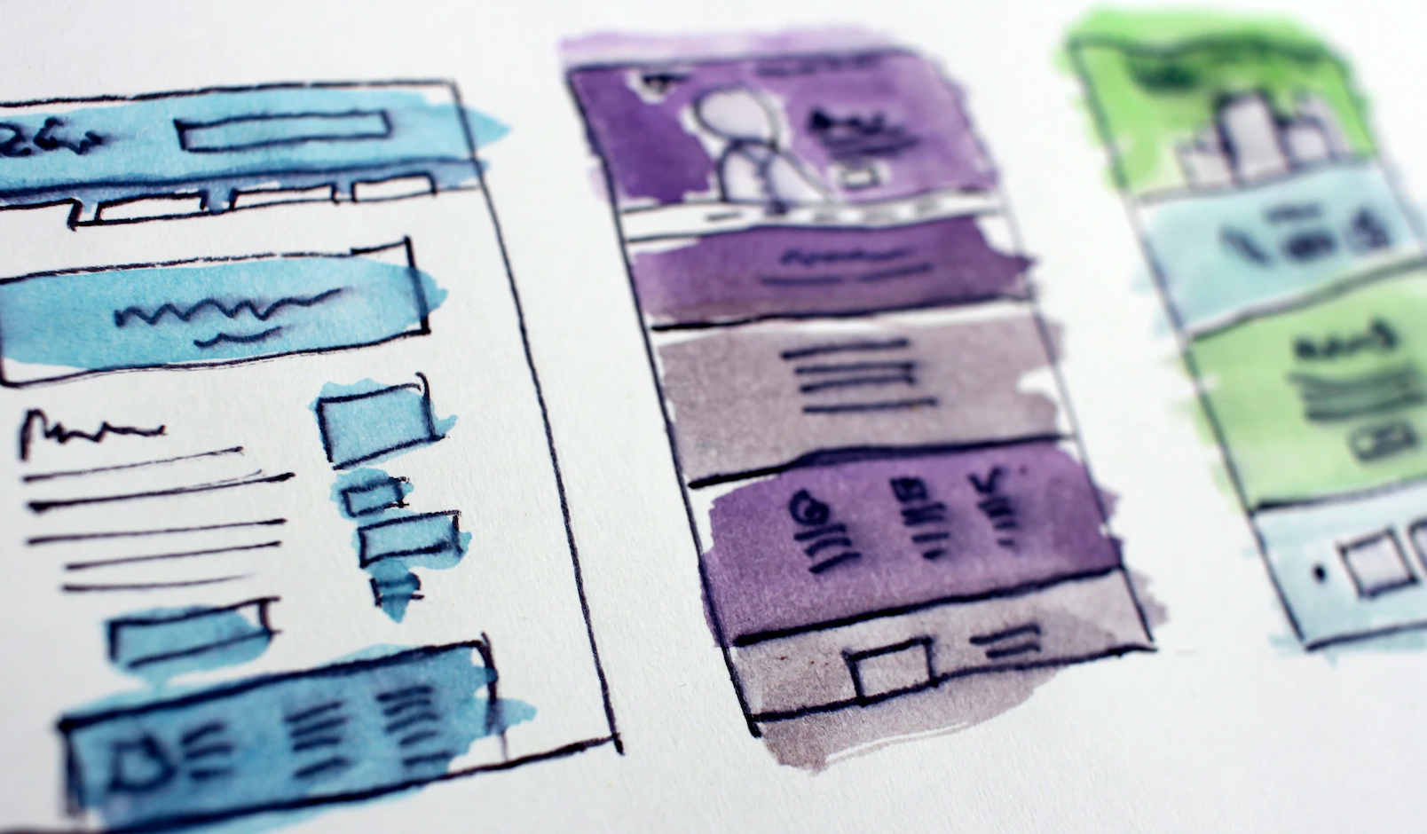
When creating a layout for a picture, designers may decide to utilize a grid to arrange the many visual components. The column grid, which divides a picture into columns of uniform size, is the most used grid pattern. The focus point of a portrait-style layout can be established by placing the image within a grid of nine equal-sized rectangles, which is a choice made by other designers. Here is a summary of the benefits of using a grid while creating layouts. It can promote harmony.
One of the simplest ways to achieve balance in your layout is to use a grid. The vertical and horizontal lines that divide your page into thirds help you balance your layout design without making everything symmetrical, which can get monotonous. Place objects on these lines.
It makes an image more unified. A grid can assist a designer in organizing the numerous unrelated components of a picture in a comprehensible and harmonious fashion.3. Establishing a captivating image. An image that is visually appealing to the viewer and leads them through the right hierarchy of information can be created using a grid as a layout template.
Layout design: Use templates as a reference
Starting from online templates is a terrific approach to learning how to develop balanced and dynamic page designs if you are new to website creation and design projects. You might also create a grid to direct yourself.
Make an image for the layout design. Find ways to provide visual contrast to your image so that it can quickly grab the attention of your audience before they have read anything. Contrast can be produced by the use of color, typography, shape, and balance.
Experiment with the typography.
Look for typefaces that add visual appeal while still speaking to the brand identity of your page. If you want to maintain a sense of coherence across various elements, you can combine several typefaces from the same font family.6. Appreciate empty space. Negative space used carefully can add more visual interest than a cluttered arrangement. If your mockups are getting too cluttered, consider going minimalist and adding more white space.